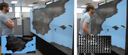
FatFonts is a graphical technique conceived and developed by Miguel Nacenta, Uta Hinrichs, and Sheelagh Carpendale.
The FatFonts technique is based on a new type of numeric typeface designed for visualization purposes that bridge the gap between numeric and visual representations. FatFonts are based on Indo-arabic numerals but, unlike regular numeric typefaces, the amount of ink (dark pixels) used for each digit is proportional to its quantitative value. This enables accurate reading of the numerical data while preserving an overall visual context.
How it works
Fatfonts are designed so that the amount of dark pixels in a numeral character is proportional to the number it represents. For example, “2? has twice the ink than “1?, “8? has two times the amount of dark ink than “4? etc. You can see this easily in the set of characters below:
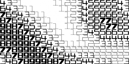
This proportionality of ink is the main property of FatFonts. It allows us to create images of data where you can read the numbers, and represent tables that can be read as images (like the example below).
Multi-level Digits
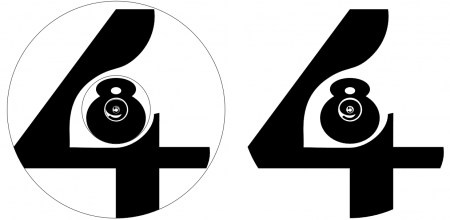
With the examples above you can only represent numbers from 0 (blank fatfont) to 9. To be able to represent numbers with a higher definition, FatFonts are designed so that they can be nested. By putting a digit that is ten times smaller than the original digit inside, we can then represent two-digit values. You can do the same inside this second digit; the only limits are the resolution of your media and the visual acuity of people.
The image above represents a 4-digit FatFont number 4,895. Naturally, you can interpret this number to be also 48.95, 4.895 etc. You just have to establish a convention on how the viewer has to interpret the numbers.
The number of the left shows you the circle that contains each FatFont digit.
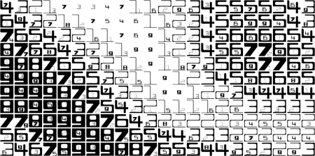
The image below is an example of two-level FatFonts used to represent a scalar field. This gives us one order of magnitude of precision more than the image at the start of this page.
FatFont type variants
By now you have probably noticed that we have created several kinds of FatFonts. The different designs balance different characteristics of the glyphs. For example, they can be round (so they can be packed in hexagons), or square (to achieve more contrast); they are similar to existing glyphs (e.g., from famous sans-serif fonts) or they are playful. We have created four different variants:
Miguta
Cubica
Rotunda
Gracilia
Examples
We have created a small gallery of example visualizations created during our research. Click on any of these images to have access to the full gallery.

Creating Visualizations with FatFonts
We would like you to create your own graphics and visualizations using FatFonts! Therefore, we have licensed the glyphs under a Creative Commons Attribution-ShareAlike 3.0 Unported License. You can use them in different ways: as fonts in your favorite program or by using the glyphs directly, you can download all available .otf, .ttf, and .svg glyphs from the downloads page.
Please, let us know that you are waiting by sending a quick e-mail.
At the moment, if you want to create visualizations based on FatFonts yourself, you will need to load the glyphs separately in your program. We are working on making these easier to use (e.g., by providing 1-level and 2-level fonts in Truetype formats). If you would like to help make this possible, we would like to hear from you!
We would also be very grateful if you can send us a quick note showing us your work if you have used FatFonts in your visualizations, infographics, or posters.
How to create FatFont types
We created ours using standard vector-image programs (Illustrator). If you want to make your own, you are going to need a way to measure the area that the glyphs cover (e.g., http://www.telegraphics.com.au/sw/browse/Filters). We recommend starting with the nine (make it as heavy as you can, with space for a number somewhere that has 1/10th of the area) and then work your way up from one to eight. Number seven is trickiest because is thin and short, but it needs to be almost as heavy as eight. To turn the glyphs into .ttf or .otf font files you will have to learn how to use a font editor such as fontforge.
When to Use FatFonts?
FatFonts are useful if a hybrid representation in needed that is both visual and symbolic. This is often the case in visualizations, but it can be interesting for infographics and posters as well. You can see some additional examples in the video of the paper, which shows how FatFont videos can help the human visual system detect change.
Naturally, FatFonts are not useful in all situations. If the focus of your visualization is to show as much data as possible with limited resolution, FatFonts will eat most of your resolution and you might not be to show much data. It can also be tricky to adapt the scale that you need to the specific range of a FatFont type (see the FatFonts_AVI paper for a discussion on this and some other limitations). We would love to hear what ideas you have to solve these problems.
Learn More
FatFonts was originally a research project for which we published a paper at the ACM Advanced Visual Interfaces 2012 conference.
![]()
FatFonts by Miguel Nacenta, Uta Hinrichs and Sheelagh Carpendale is licensed under a Creative Commons Attribution-ShareAlike 3.0 Unported License.


