Here are a few examples of FatFont visualizations created by ourselves. Please, notice that this is all still work in progress.
Click on the pictures to see the full resolution versions.
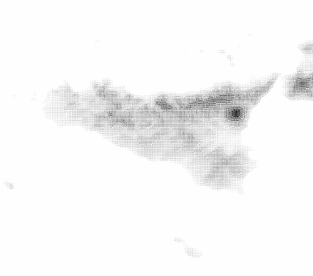
Topography of Sicily
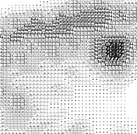
Here the numbers that you read represent the relative topographic height of the terrain with respect to the highest point (Mount Etna = 99).
And a close-up around the big volcano.
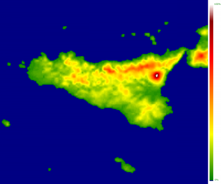
You can compare these to their colour scale equivalents:
And the close-up:
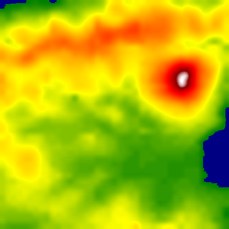
They all have the same information, but the numbers in the FatFont examples allow you to make calculations on what you see. For example, with FatFonts you can trace the lowest path across the mountain range in the North of the island, or calculate exactly which ones are the second and third highest points in the area.
The data is taken from NASA.
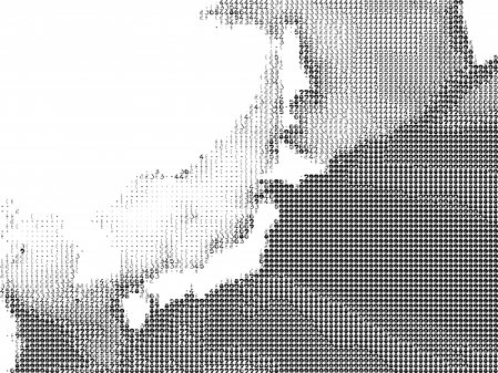
Tohoku Tsunami Wave Height (Predicted)
This visualization presents data of wave size prediction for the devastating tsunami that took place in the Eastern coast of Japan in 2011. Values above 1 meter were clipped.

And a different version with a different font:
Wall Displays
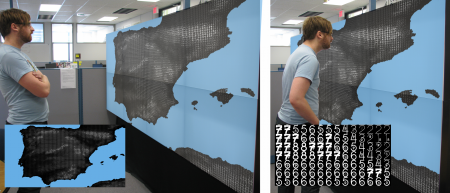
We have found that FatFonts work well in high-resolution display walls. If you need to read a value, you can come closer, but if the overall picture is more important, just step back.
Histograms
The following graphs represent three alternative ways to represent histograms: through a box plot (left), through FatFonts which count the number of points inside each box, and by representing separately each point.


Text Visualizations
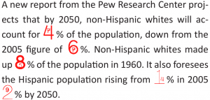
FatFonts might also be useful in text, to bring attention to the quantitative aspect of certain numbers.
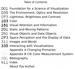
This example uses a weight-flexible variant of Gracilia to represent the chapter size through the pages where they start:
Colour Maps
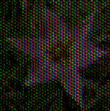
The image below shows a flower; if you can read the pixels, these represent with FatFonts the different proportional components of colour for each pixel (click to see the full version).
Other Map Visualizations
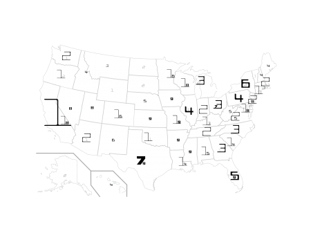
This is a visualization of the population of the US using FatFonts. The FatFonts indicate percentage of the overal population (only one state has more than 10%).
